Showing posts with label By Racheal Idowu. Show all posts

Tuesday, 27 March 2012

Question 3 : What Have You Learned From Your Audience Feedback

When we completed our teaser trailer, poster and magazine, we used media technologies to promote our product via popular social networking sites such as facebook, twitter and youtube.
Youtube was a great way to promote our product as it is public and a lot of people can view/ share videos on it. We received, quite a few feedback both positive and constructive criticism.  
Overall, the feedback was considerably positive, the majority seemed to like the fact that it looked professional, they liked the make-up and the whole 'Karma' concept.
However, the positive feedback also came with constructive criticism; the audience thought that we should of kept the suspense and not have shown the protagonists face. From this we learnt that when challenging conventions, you must always think if its going to suit/please the audience and if its worth the risk taking.


The feedback that we received from our movie poster was very positive. 95% of people said the reason why they liked it was that it looked very professional and that it looked like an actual movie poster. I then asked them what made it look professional, and they said it that it was the effects on the images, that it stood out from the page and the darkening effect gave it that horror aspect.They also liked that the victim was in the corner, that it gives them a sense of what the concept is about. The only criticism that we received about the poster was that we should have hidden the villains face with a mask so we don't give away too much. From the audience feedback we learnt that we should always look at different points of view when challenging/developing conventions. We also learnt that we need to consider the views/concerns our target audience may have.


The feedback that we received from our magazine were both positive and negative.
The majority said that they love the layout of the page and the positioning; they also liked the fact that we used the same colour throughout and that they go together well. However, we also received some constructive criticism. A few people said that the villain should have been dressed in darker clothing for instance black combat trousers. Some said that the font looked a bit plain, that they would have prefer ed if it was bolder. From this we have learnt that once a product is done, we need to carefully think of every aspect such as the text, colour, image and whether it would be attractive/eye catching for our target audience.

Tuesday, 10 January 2012

Profiling Audience

The usual horror film target audiences are usually male. As our teaser trailer storyline is about bullying, we decided to aim our audience at not only males but also females who enjoy watching horror films. The target age of our teaser trailer will be the ages of 18+ as the horror genre and the storyline would appeal to this age.

Our ideal target audience will be young, retro and urban. We chose retro because some of the films we used in our mood boards were quite old and retro films films such as the Texas chain saw massacre and a nightmare on Elm Street.


Friday, 25 November 2011

Film age rating

The British Board of Film Classification regulates the media, especially DVD/video, film and video games and is also a service provider for new and developing media. They provide media industries with the security and confidence of cost-effective, publicly trusted regulation and help to protect providers from breaches of UK law.


They help to protect vulnerable viewers and society from the effects of viewing potentially harmful or unsuitable content while respecting adult freedom of choice and have the right to make changes/ban films that they class as inappropriate.


*      For example, Cannibal Holocaust whereby the had  to make five minutes 44 seconds of cuts to remove unacceptable elements which cuts were required in eight individual scenes, four scenes of sexual violence and four scenes of animal killing.


We decided to aim our target audience at the ages of 18+. This is because the horror genre we have chosen is a slasher which is quite similar to films such as the Texas chainsaw massacre, valentine and a nightmare on Elm Street which were also classified as 18 because of the content. Also, our storyline is based on bullying in which the Protagonist is a pretty outgoing popular girl who goes partying; which will most likely appeal to an older audience.

Wednesday, 23 November 2011

Software


Throughout and during our A2 media coursework, we as a group will be using a variety of different software programmes in the pre- developing and producing our coursework piece.
Firstly, we are currently using a blogging website ‘blogger’ which is used to update and store all of our collective and individual work and research. All of our ideas and research that we post up is a build up of our final project, whereas research and picture drafts have been condoned in the pre-making of our film poster, horror magazine front cover and our teaser trailer. Also, blogger is easy for us to use as we have all used this site before and it is easy for all members of our group to access. Blogger also enables us to organise our work efficiently and to also keep track of where we’re a t with our work.


We will be using Microsoft word to type up some of our work such as the treatment, profiling audience and the textual analysis to help build our blog.  


Photoshop is a software that we are all familiar with from using it in our AS coursework;
although Ayo is more skilled in photoshop in which he will be using to create our Film Poster and Magazine in which as a group will help him. We also used photoshop in creating our moodboard. Photoshop allows us to be creative with our product as it provides a variety of different tools and enables us to use a wide range of colours, graphics and fonts.


Final Cut Pro x is a software that we are all new to, although Josh is skilled in the editing of videos in whixch he will primarily be using this software in the editing of our teaser trailer; whereby we as a group will also contribute in helping him. As a group, we have also practiced using this software, as we filmed a short clip in class and we used final cut pro to cut a few bits out and also to put scenes together. 

Music soundtrack pro will be used to edit and produced the music and voice overs that we will use in our teaser trailer. Also, this was used in the opening of the trailer whereby there was a voice over conversation with the protagonist and the antagonist.

Monday, 21 November 2011

Storyboard Script

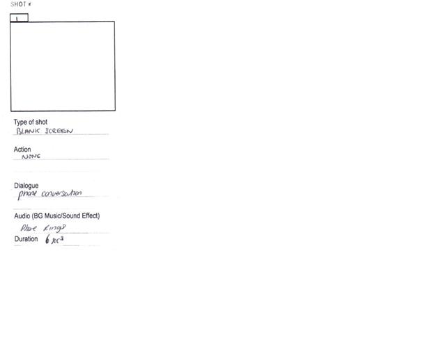
The opening scene consists of a phone conversation between the Antagonist and the Protagonist. This automatically lets the audience know what is likely to take place in the film; as it indicates that someone is being taunted after. This scene is similar to the opening of the scream 4 teaser trailer.


In this shot, we see the Protagonist opening a door, which she does not enter. It gives the audience the feel as to what lies behind closed doors.


In this shot the Protagonist is tied to a chair, crying which gives the audience the impression that she’s been held hostage/kidnapped.


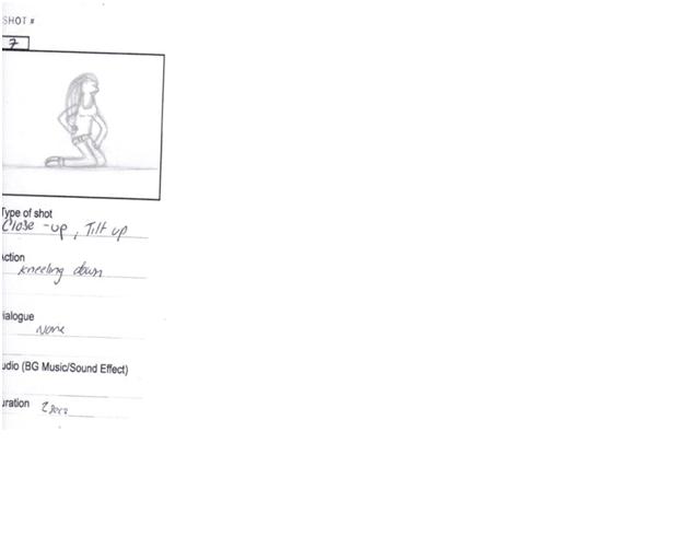
In this shot the Protagonist is kneeling down on the floor, looking helpless and vulnerable – panting.


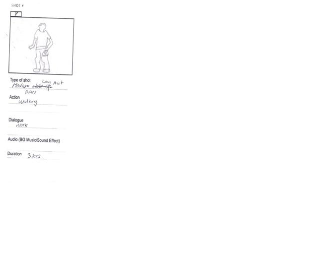
In this shot will be a pan of the Antagonist walking with its weapon (circular saw) also a smoke machine would be used.


In this shot we see a medium close up of the protagonist in a wardrobe. She lights the lighter and notices the blood and limbs in the wardrobe and screams.


In this final shot, a caption will go across the scene saying Guess Who, followed by our film title KARMA.

In this shot the Protagonist is running. This shot doesn’t show the audience what exactly she is running from – this was used to create suspense.


In this shot the telephone rings. The phone is a significant prop in our Teaser trailer as the Antagonist uses this to contact its victim.


In this shot the Protagonist is facing a wall filled with paper with insults written on them. This was used to portray that our storyline is to do with bullying. This gives the audience a clearer film of what the film may be about.

Wednesday, 16 November 2011

Our Prop Ideas

                                                                  Mobile Phone
This prop is essential and  will be used in our first scene , as it consists of a phone conversation.  This is essential because it sets the story out for the audience because it gives them an insight as to what is going to happen in the film which will leave them in suspense. This also lets the audience build an idea in their head of the leading up of the teaser trailer and what will occur in the film.

                                                                         Chair
                                                                
This chair is needed for shot 4 of our teaser trailer. This shot will be a medium close-up of
the Protagonist crying, tied up sitting on the chair, held hostage. The reason why we chose a
medium close-up shot is because through this we're able to see the Protagonists body language
and posture as well as seeing her facial expression in which the audience will have an idea of what
is or what will take place in that shot.


                                              Lighter
This lighter is significant in the shot 6 of our Teaser trailer because when the Protagonist lights the lighter she sees that she is in a wordrobe full of limbs which is also
revealed to the audience; the lighter enables the audience to see the reaction tof the Protagonist
through her facial expressions.


                                                           Circular Saw

This Circular Saw will be used for the Antagonists weapon. The shot will be a medium long shot of the antogonist holding the weapon; so he dosent actually use it in our Teaser trailer
to attack the protagonist. Us as students are not licensed to purchase this tool, so we are going to borrow it from the DT department with there consent that we are eligable to use it.


                                      Smoke Machine
This smoke machine will be needed for shot 7 of our
teaser trailer. This shot will consist of the Antagonist
kneeling down on the floor outside which is where the smoke machine will be needed to give the effect that she is in a misty location such as a forest. This may also set the mood of the shot as the colour Grey is usually seen as a dull, moody colour.


                         Wardrobe

This wardrobe will be used in shot 9 of our teaser trailer. The Protagonist will be hiding in this wardrobe which will consist of limbs inside of it.

This rope will be needed in one of our scenes to tie the Protagonists hands together
to portray what is going on in the shot e.g being held hostage    


Mannequins arms and legs will be needed in our teaser trailer as one scene will be held in a wardrobe whereby the limbs will be present hanging around posing as people arms and legs of victims that been previously be captured and killed.

Monday, 17 October 2011

Audience Research


EVALUATION

From the above audience research I was able to gather a lot of information and ideas that I could discuss with my group members to incorporate into our pre-production. As the interviewee said that she was most interested
in the horror genre, i decided that it would be a good idea that my group focused on this
particular sub-genre. I was able to gather points such as what we should include in the 
teaser trailer that will tease our audience and give them the suspense to really get the feel of a teaser trailer. From 
this were able to look back at our initial ideas and are able to mend/change certain areas to meet the target audience expectations. 
Also, I was able to gather information on what type of props were suited best for our teaser trailer. For example a knife is more suitable to use than a gun for a slasher film; i was also able to gather the horror conventions that
our target audience expected from our teaser trailer such as blood.
This qualitative research will be very helpful in planning the pre-production of our horror teaser trailer such as
what horror codes and conventions to use and what rating to use. From this I learnt, that a teaser trailer is not meant to give much away and that is meant to create suspense within the audience.

Texual Analysis Of A Horror Poster


The main image denotes a medium close-up of a blonde Caucasian female. The shot type may have been used to emphasise the main image as the angle and the posture of the woman is arched and her facial expressions and gesture is very dramatic which portrays the strenuous effect of the hand that’s dragging her. Also, her facial expressions, and the titling back of her head denotes that she is being dragged by a monster or a supernatural being as we can tell by the skin and the claws of its hands. From the image we can assume that the hands is of a demon or some sort of demonic being as it is coming up from the fire which signifies hell whereby demons reside. From the main image we already have a clear picture of what is going to happen in the film as the title is ‘drag me to hell’ and the main image connotes that the antagonist is being dragged to hell which the flames, her gesture and the hands connote. A common convention of horror films such as scream, scary movie and a nightmare on Elm Street is that the blonde popular girl ‘who deserves to dies’ dies is the protagonist in which this film uses that convention. Her costume contrasts with the whole ‘dumb blonde’ stereotype as she is wearing a blazer whereby smart business people wear. This might be that maybe director wanted to challenge this stereotype.

The main colours used in this poster orange along with low key colours such as black and grey. This connotes a horror film synopsis because the colours give off a fearful, creepy and scary feeling, as the colour black is usually associated with death for example people wear black to funerals. Also, the colour grey can symbolise sadness in which may be used deliberately to link in with the main image because we can see the victim being attacked. Also, the colour Grey seldom evokes strong emotion in which we can see this through the characters facial expression that she is going through some sort of pain. Also, and the colour of the flames may represent the danger that occurs in horror films and also may connote fear and death. The colours used in this film poster are very significant in relation to horror because they all contribute by the colour connotations, the aspects of horror.
The composition of the protagonists is in the middle of the shot, this may have been done so that the audience can clearly see what is taking part in the shot and also so that it can stand out. She is also positioned in front on the houses and buildings which may connote gives us an insight as to what is going to happen in the film because the positioning shows that  this particular shot is the highlight of the film because it portrays it as of such importance. Also, the shot type is a medium close up which may be used to emphasise what is going on in the shot. Also, the anchorage of the text helps the audience to understand the context of the image. The title ‘Drag me to hell’ immediately gives the audience an insight as to what the film is about as the image does what the title says. This may be used as a teaser for the audience, as they may be intrigued and eager to watch the film s they already have a clear idea what it is about. Also, this may also leave the audience in suspense as they may be trying to figure out what will happen in the film. The title grabs the audience’s attention because it tells the audiences what they’re in for.

The text is in a small white stencil font and all the letters are in capitals which is positioned at the bottom of the screen. The font chosen is very sharp which really outlines the words ‘Drag Me to Hell’; this may have been done specifically as it exaggerates the words like you would really want to be ‘dragged’ to hell. The colour white symbolises cleanliness and purity which contrasts highly with the title, the white may have been used to signify that the protagonist is pure to show the link between her and hell. The text is positioned at the bottom of the screen; this may be in relation to ‘Hell’ as we know that hell is at the bottom below the earth in which the flames denote. This may be used to put emphasis on the title and to draw the message across that the woman will be dragged to hell which teases the audience because we don’t whether she will be dragged to hell.

The tagline states that “Christine Brown has a good job a great boyfriend, and a bright future. But in three days she is going to hell.” The tagline along with the main image and the title gives away the main the storyline and tells us a bit of what is going to happen in the film. This may have been done to draw in an audience, by giving them an insight as to what happens so they could be more eager to find out what happens so they can watch it. The tagline is written directly above the title; this may have been to tease the audience because after you finish reading it the title is below and it makes you want to know more and to go and see the film. The font size of the tagline is very small compared to the title, which may have been done to make the title stand out. The colour used (White) is the same as the title. From the tagline we can build a picture in our head of the type of the lifestyle the protagonist lives and from this we can also see that she isn’t the typical ‘dumb blonde’.

The background of this film poster denotes big houses. This connotes that the location of the film may have been around a suburban area. Horror films are usually located in quiet areas such as the suburbs.

To conclude, overall I think this film poster definitely appeals to its target audience. It meets its main purpose of persuading the audience to go and see the film through the main image and the tagline; which creates suspense within the audience as the tagline teases them. However, I do think that they should have given less in the tagline because now the audience can automatically decide whether the film is worth seeing which can be a disadvantage as well as an advantage.