How useful was www.youtube.com ? How easy was it? Why did you use it and how?
Youtube was very useful in our post production whilst we were doing our audience research.
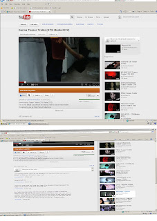
We used YouTube to search for horror film teaser trailers in helping us complete the textual analysis, which broadened my knowledge on what is meant to be included in teaser trailers and how long it should be and also to research horror films that were similar to our horror genre.
For example:
It also gave us a clear view on what type of shots and camera angels to use for our teaser trailer such as close ups and tracking shots. For example the type of lighting we should consider whilst doing the shots like mainly it consists of a main light, "Key Light", which lights your subject, a "Back Light" to help define the subject from the surroundings and a "Fill" for the shadow.
We also used youtube in uploading a voice over we used for our teaser trailer on our youtube page which was very convenient and useful, in hearing whether it sounds right and was up to scratch to add in our teaser trailer.
Another way that youtube was useful is that we were able to research videos on how to do make-up using blood and latex and how to apply different type of wounds. This was very useful in creating wounds during our preparation for filming.
How did you use the internet?
The Internet was used as a powerful tool to complete and set up a solid foundation for our research on our target audience, for us to conclude what our trailer would need to be to attract our audience. Youtube was used as a research tool where horror slashers trailers would influence us on how our trailer should be. In addition images of empire magazine was used as a guide and made many comparison with certain horror magazine to our production and used some of their conventions such as the bold and plain headline
Slasher horror films such as Valentine, Scream, And Texas Chainsaw Massacre, what shared similar storyline to our production of "Karma" was used for inspiration. Watching these trailer via Youtube and other film trailers being viewed by the use of technology such as DVD, online film streaming, and previous films that we had all seen previously was discussed and inspired us to use conventions that they had used such as the final girl and her being tormented by a phone call which happens in the blockbuster "Scream".
The internet was very useful in doing re-search into horror films; which was beneficial in using push and pull
technologies to exract the information needed.
Google was very useful in researching different horror genres, the conventions of horror genres, and how they differ to one another. This enabled us to choose from which horror genre to do for our final production. Also, using the internet we were able research the conventions of horror magazines and posters which gave us guidance as to how we should make ours.
Did you watch any horror films for inspiration?
Part of our summer research was to do research on horror films and to watch a few horror films.
I watched films from 6 of the different types of horror genres such as; I am legend, jeepers creepers 2, one missed call, drag me to hell, Saw and the underworld on DVD and Online. From watching these films from different horror genre, when we as a group came up with ideas for a teaser trailer i knew that i wanted it to be a Slasher. Also, it definetely gave me ideas on what to include in our teaser trailer. For example, a weapon, blood, male antogonist, final girl theory.
These horror films gave us inspiration for our teaser trailer as theyre are both from the slasher horror genre and they use the final girl theory in which we decided to include in our teaser trailer.
Production/Filming
For The Editing Of Our Teaser Trailer We Used Final Cut Pro And Soundtrack Pro Which Are Two Programs Which Are Linked Making It Much Easier To Use Together For The Editing. We Used Final Cut Pro In Order To Use The Scenes We Have And Put It Into A Sequence The Group Was Happy With, Then Once Done I Started To Apply Some Effects, Such As Tint, Brightness And Contrast, Cutting Scenes During and Controlling The The Pace. I Also Had An Image Speacially Made Of Our Logo In Order To Input It As A Introduction To The Trailer. Earlier On We Had Chosen A Font We Wanted For Our Title To Be Used In Out Magazing Front Cover, Poster And The Trailer, This Font Was Employed And Used Int The Trailer For The Title And Even Used In The Captions. All This Was Done To Ensure That The Trailer Followed and Developed And Where Possible Even Challenged Conventions Of Horror Teaser Trailers.
When Using Soundtrack Pro I Had To Import The Video Sequence From Final Cut Pro In Order To Have The Sound In Sync With The Sequence Making It Easier To Edit And Use. In The Making Of The Sound For The Trailer, I Had To Learn How To Input Sample Sounds And Edit The Length And How Loud It'll Come Out In The Final Video. During The Editing Of The Sound For The Video My Group And I Decided That We Wanted To Input A Sound From A Music Prodecer To Give The Trailer An Upbeat Tempo, For This We Needed To Go And Get Permission To Avoid Copyright Laws, Also At First I Didn't Know How To Do That Until Doing Further Reasearch Into How I Would Do This. Also Wanted To Include A Pre Rocorded Phone Call Which Was Scripted To Be Included Into Our Trailer. Once Everything Was Done The Trailer Was Finished And Uploaded, Made To Be Less Than One Minute Which Is Usual Length For A Teaser.
Once Finished As A Group We Started Advertising The Trailer In Order To Get Nessasary Feedback On Social Networking Sites, Messengers And Within Our College Itself.
After we selected all the good shots that were shot during our trailer; Joshua and I started putting the shots together and watched the teaser to see how it could be improved. We then decided to cut and input different shots in between different shots to add the effect of tension and suspense.
We then decided as a group as to where in the teaser trailer we would position each of our captions and what type of colour, font and transitions we would use. We placed each caption based upon what was occurring in each shot so it could build tension and suspense within the audience and which would also leave them to question as to what is next and to what is going to happen next. We chose the colour white for the font because the colour connotation of white is usually linked to craziness. For example, all white rooms. We wanted to portray this using a simple hard edged stencil font.
We used Photoshop to edit our poster and magazine. One of the tools we used to edit the images was the 'feather tool' this was used to soften the edges of the image so that it looks natural with the background.
We also used a [insert tool] to bring out the images to give off that 'dark, scary' effect, to make it stand out from the background and to also make it look more professional.
Describe using your own brushes, downloading copyright music, recording sound effects.
In our teaser trailer we used digetic sound of a phone ringing and we recorded a voice over of the protagonist and the antagonist having a conversation.
We also used an instrumental from the artists Krept and Konans song.
The download link showed that we had permission from the person who made the video to use the instrumental. so there are no copyright infringements.
What video techniques did you use?
In our teaser trailer we used a variety of quick cuts to imply either energy and to create suspense in the two different shots of when the protaganist is walking and the other when the antagonist is limping.
We used the fade out transition in a shot where low key lighting to create suspense before the next shot was shown.
The use of media technologies.
In terms of marketing strategies we used various media technologies for the distribution of our product which played a big role in the making of our promotional package.
The use of media technologies such as youtube, facebook, twitter and the Internet for the distribution of our product was very beneficial in terms of marketing our product.
Posting our product on our 'clear view' facebook page which is
public, gave us a great gateway in advertising our product, as people could freely view, like and leave comments on our poster, magazine, and teaser trailer.
Uploading our teaser trailer to our youtube page, was a great way to distribute our product, as it is public so everyone can view it and leave comments. YouTube was a good way for spreading the word for our teaser trailer as people are able to share our video through:



Movie Poster & Movie Magazine Front Cover (Print Production/Advertising)
In the period leading up to the filming of our teaser trailer we spent an immense amount of time doing planning and research towards the creation of our trailer. One element that we focussed on was lighting. One of the main lights we had to use was the Kino Flo: Diva Lite 400.
We initially planned to use this as our main source of light in some shots but upon arrival at the studio, which was the setting of our trailer, we found that there was enough natural light.
Another light we used was the HDV-Z96 kit.
In the shot where the protagonist flicks her lighter twice before finally lighting it the third time.
We used this small light to replicate the lighting of the lighter. To add to the flickering effect we shook the light from side to side thus giving a flickering light effect.
For our movie poster and magazine front cover we used Adobe Photoshop CS3.
Prior to this project I already had some skills in photoshop. During the creation I developed my editing skills, more particularly the shadow/highlight feature.
This feature was effective as it gave me the ability to control the light and dark areas in the image I was editing. It also helps the subject stand out more. The shadow/highlight feature does all of this without disrupting the overall balance of the image.
A website that I used during the process of creating my media products was DaFont. The default fonts on photoshop were either too plain or were not fonts that suited a horror film. As a result, we had to download fonts from DaFont. This website contained over 10,000 fonts available for download. They were split up into categories which made it easier for me to search as there was a horror category.
Despite the availability of fonts, we had to be aware that some fonts were not free for public use.
We found that following health and safety rules was important when filming our teaser trailer. We were unfamiliar with the studio so did not know of the possible dangers that may be around. Our prop, which was an axe, was a real axe. We took extreme care when handling the axe. We made sure that we did not let any habits get the best of us such as swinging our arms to ensure safety. Others around us also made sure they made no steady movements when the axe was being handled again to ensure safety.
We used a number of technologies when aiming to follow magazine conventions. In regards to our planning and research, we used the safari web browser to go onto google images to search and gain insight on other magazines and to look at common conventions. I then used photoshop to create these conventions such as coverlines which was simply done using the text tool.


No comments:
Post a Comment